How to Organize Figma Components Efficiently
Design
Feb 14, 2025
Feb 14, 2025
Learn efficient strategies for organizing Figma components to save time and enhance design workflows with clear structures and naming conventions.
Organizing Figma components can save teams 30% of their time and boost design speed by up to 40%. The key is to create a clear structure, use consistent naming, and leverage Figma's tools for scalability. Here's a quick summary:
Follow Atomic Design: Break components into Atoms, Molecules, and Organisms for clarity.
Use Clear Naming: Adopt a "Category/Subcategory/Component" hierarchy (e.g.,
Forms/Input/Text).Organize Pages: Group related elements (e.g., Colors, Typography) into dedicated pages for easy navigation.
Leverage Auto-Layout: Use padding, alignment, and resizing for responsive designs.
Maintain Libraries: Regularly update, archive old components, and document guidelines.
These practices ensure smoother workflows, consistent designs, and scalable systems. Ready to streamline your Figma projects? Let’s dive deeper.
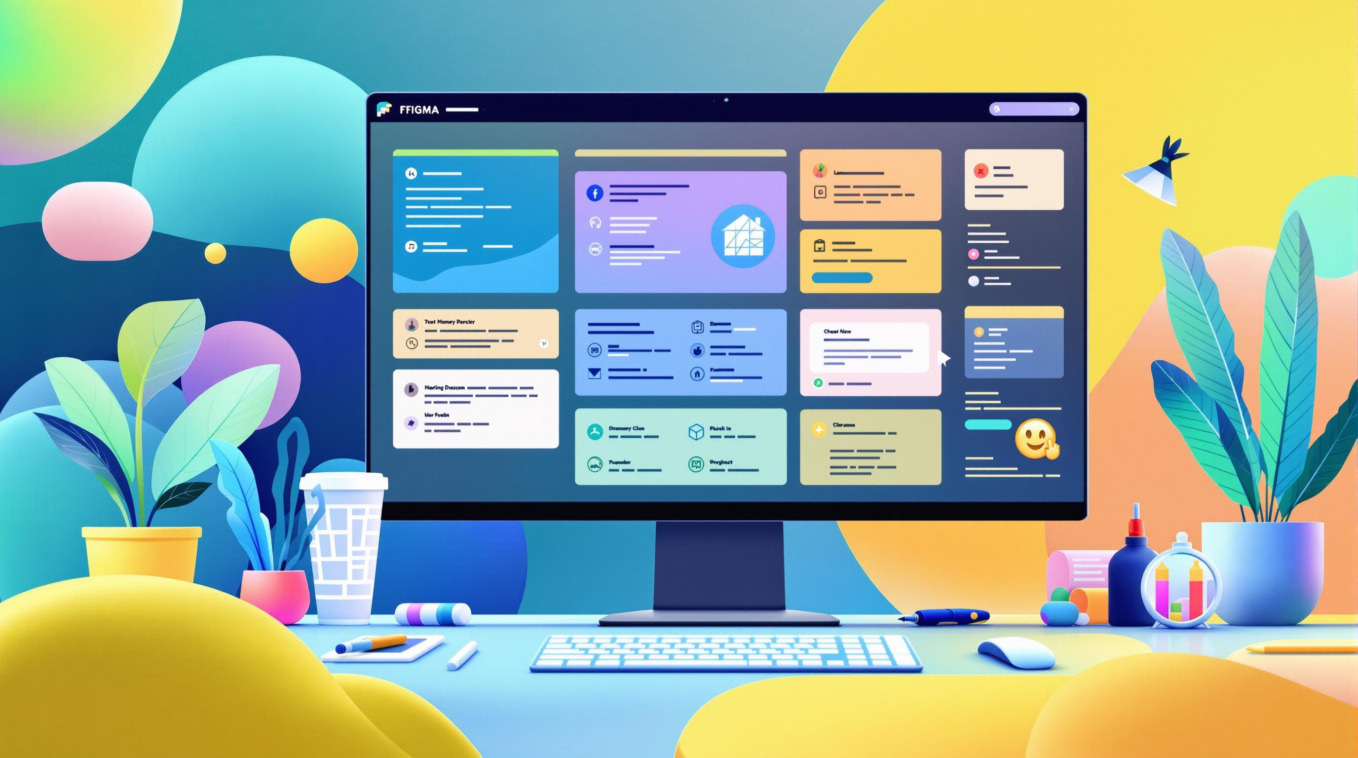
Master Figma Components in 10 Minutes
Basic Rules for Component Organization
Organizing components effectively in Figma starts with setting up clear, structured rules. Brad Frost's Atomic Design methodology [1] offers a helpful framework, dividing design systems into five levels.
Applying Atomic Design in Figma
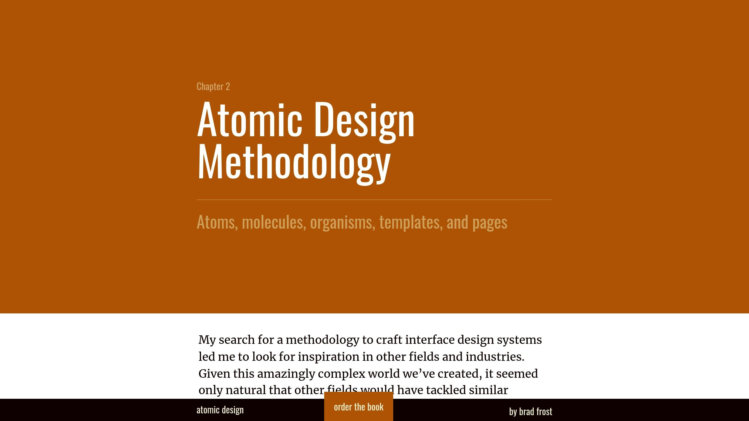
Break components down into three key levels:
Atoms: These are the building blocks, like buttons, inputs, and icons. Keep these in a dedicated "Atoms" page.
Molecules: Combine atoms into functional units, such as a search bar (input field + button). Store these on a "Molecules" page.
Organisms: Group molecules to create larger interface sections, like headers (logo + navigation + search bar). Place these on an "Organisms" page.
With this hierarchy in place, use Figma's built-in tools to organize and manage your design elements.
Organizing Core Design Elements
To streamline your workflow, organize essential design elements using Figma's features:
This structure ensures a consistent and efficient design process.
Component Naming Guidelines
Organize your Figma component library effectively with these naming strategies:
A clear and structured naming system is crucial for maintaining an organized component library. It helps teams locate components faster and ensures consistency across projects. In fact, consistent naming can reduce search time by 40% in libraries with over 500 components.
Using Category Folders
Organize components with a logical "Category/Subcategory/Component" structure:
This hierarchy simplifies navigation and keeps your library tidy.
Naming Component Variants
Standardize the order of properties when naming variants:
You can also use formats like Button/Primary/Large/Hover or ButtonPrimary__Large__Hover for consistency.
Choosing Text Case Styles
Pick a text case style that matches your development framework and team preferences:
These text case styles ensure clarity and alignment with coding standards.
Setting Up Component Files
Once you've established naming conventions, it's time to organize your components using Figma's built-in tools.
Organizing Pages and Frames
Figma's pages and frames help you create a clear hierarchy for your components. Align these with your Atomic structure by grouping Atoms, Molecules, and Organisms logically.
For example, your Foundation page should include Atoms like colors and typography. Other pages, such as Buttons or Forms, can house Molecules and Organisms based on your hierarchy. Group related components into individual frames to make variant swapping quicker and more efficient during design work.
Adding Component Instructions
Clear documentation is key to ensuring consistent use of components across your team. Add a "Guidelines" frame at the top of each component page to include essential instructions.
Use descriptive keywords like "input" in component descriptions to make them easy to search. Regularly update documentation - aim for quarterly reviews - using Figma's text layers and comments. This helps minimize errors and speeds up onboarding for new team members.
Building Scalable Libraries
Creating component libraries that can grow with your project requires thoughtful planning and effective use of Figma's features. By leveraging Atomic Design principles, you can develop systems that adapt as your needs evolve.
Setting Component Properties
Component properties help you create a flexible design system. Align these properties with your Atomic Design structure to ensure seamless scaling:
By combining multiple properties, you can create dynamic elements that stay connected to their master components.
Using Auto-Layout Features
Auto-layout is essential for building responsive components that adjust across different screen sizes. Focus on these key settings:
Use nested auto-layout frames and constraints to maintain consistent visuals across devices. This approach works well with the component hierarchy in your pages and frames.
Managing Team Updates
Organize updates with a clear process:
Figma's branching feature is perfect for testing major updates. Share regular changelogs to keep everyone in the loop and document updates in your component guidelines for easy reference.
Working with External Resources
While your internal systems are the backbone of your design process, external resources can help speed up component development. For example, Spotify's design team reported in 2023 that using shared component libraries cut UI design time by 40% across 12 product teams in just three months [2].
Getting Started with uncoverLAB

uncoverLAB offers a library of Figma resources that can enhance your Atomic Design system. Here’s how to use these resources effectively:
Make sure these external components follow the same naming and organizational rules you’ve already put in place.
Sharing Components Between Projects
When working across multiple projects, maintaining consistency is key. A clear component hierarchy can help streamline this process. Here’s a simple approach:
To ensure smooth integration of internal and external components:
Develop a unified style guide that includes both internal and external components.
Use clear naming conventions to differentiate between internal and external resources.
Keeping Libraries Up to Date
Integrating external resources can speed up component creation, but regular maintenance is what keeps them useful over time. Staying on top of updates helps ensure your library remains scalable and easy to work with.
Quick Component Renaming
Renaming components efficiently is key to staying organized. Figma's Rename Layers tool makes this process simpler:
For more advanced renaming needs, the "Rename It" plugin is a great option. It can handle bulk updates while keeping your naming hierarchy intact [1].
Removing Old Components
Outdated components can clutter your library if not managed properly. Follow a clear deprecation process to keep things tidy:
Review usage through instance tracking.
Add visual labels to show the deprecation phase.
Archive unused components every quarter.
Instead of outright deleting components, move them to a dedicated archive page. This keeps your library clean while retaining historical context [3].
Syncing Design Styles
Keeping design styles in sync is just as important as managing components. Use these methods to stay consistent:
Figma's variables feature is particularly useful for making global changes quickly [4]. Combine this with regular sync checks and clear documentation to ensure everyone on your team stays aligned [1].
Conclusion: Advantages of Organized Components
Using Atomic Design principles and consistent naming conventions can transform how teams work. It leads to smoother component systems, unified brand experiences, and more efficient design workflows.
When components are well-organized, they create a shared design language that speeds up onboarding and minimizes the time spent on iterations. This structure allows designers to focus on solving real challenges instead of managing components, resulting in better solutions and quicker project turnarounds.
Tools like uncoverLAB's libraries offer a head start in organizing components. These resources align with internal design systems while supporting established practices and allowing for customization.
The impact grows when paired with regular upkeep. Combining these strategies with quarterly maintenance ensures design systems remain effective and ready to scale as needed.
FAQs
How should you organize Figma files for a design system?
Use the page/frame structure detailed in Setting Up Component Files. For example, group related elements like buttons or forms on separate pages, and organize their variants in well-labeled frames. This method keeps files clear and easy to navigate.
What are effective naming conventions in Figma?
Refer to Component Naming Guidelines for a structured approach. Use slashes to create hierarchies and keep text cases consistent. This practice improves searchability and ensures your design system remains consistent across all projects.
How can you organize components in Figma?
Stick to the scalable methods outlined in Building Scalable Libraries. Group components by categories, maintain logical relationships between colors and styles, and leverage Figma variants when needed. This system allows for easy management now and smooth scalability in the future.