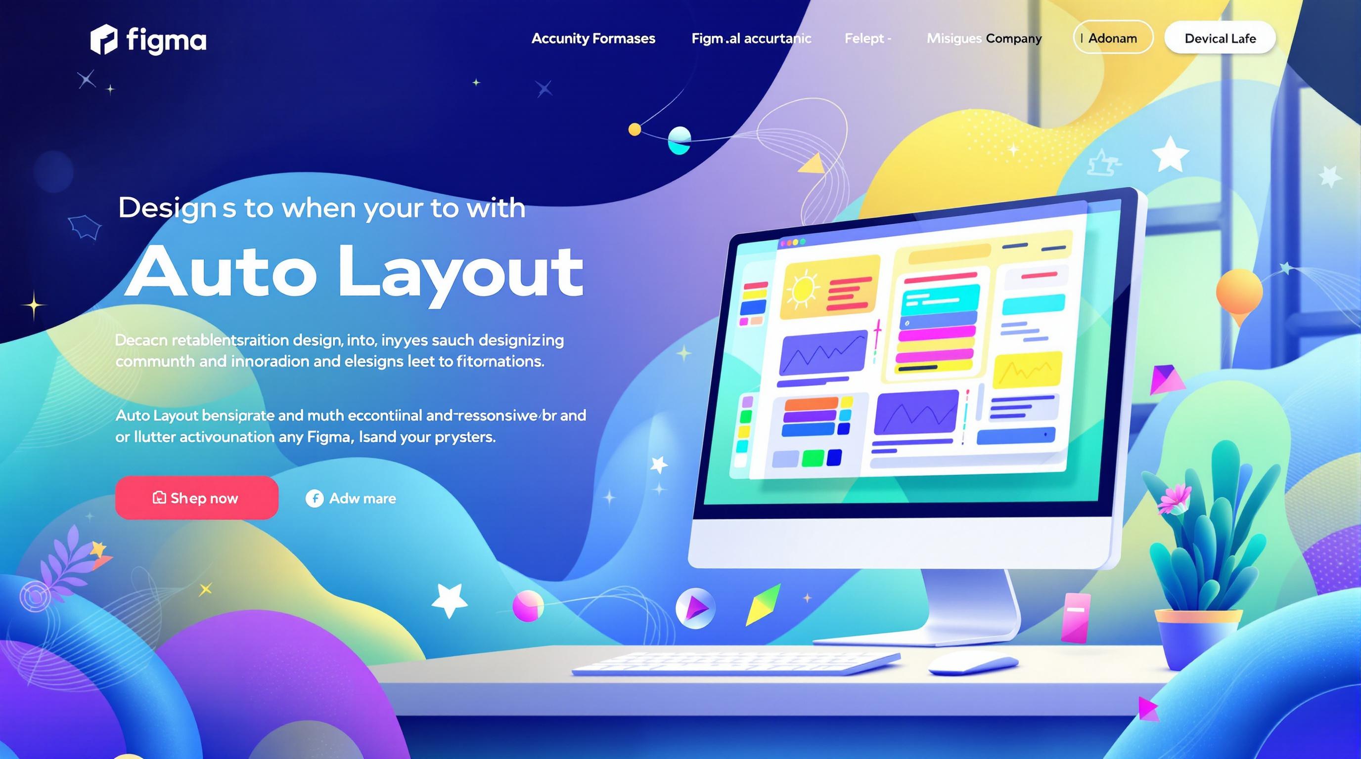
How Auto Layout Builds Responsive Components
Design
Feb 7, 2025
Feb 7, 2025
Learn how Auto Layout in Figma simplifies the creation of responsive designs, ensuring consistency and efficiency across components.
Auto Layout in Figma makes creating responsive designs simple and efficient. It allows components to adjust automatically to content changes, saving time and ensuring consistency. Here's what you need to know:
Key Features:
Automatically aligns and spaces elements based on rules.
Easily transforms static frames into dynamic, responsive components using
Shift + A.Handles resizing, overflow, and alignment challenges effortlessly.
Benefits:
Saves time by eliminating manual adjustments.
Ensures uniformity across designs.
Adapts components to different screen sizes and content lengths.
Simplifies workflows, letting designers focus on creativity.
Practical Use Cases:
Designing cards, navigation menus, grids, and forms.
Managing content overflow with constraints and padding.
Using nested layouts for complex designs.
Tips:
Keep layer structures clean and organized for better efficiency.
Test components with varying content to ensure responsiveness.
Auto Layout is a powerful tool for creating flexible, responsive designs quickly and effectively. For advanced setups, explore pre-built templates like uncoverLAB’s library to save time and learn best practices.
A Guide to Auto Layout: Best Practices, Tips & Tricks
File Setup and Organization
Getting your Figma workspace organized is crucial before diving into Auto Layout components. A well-structured file makes it easier to build responsive designs that adapt smoothly to various screen sizes.
Frame and Layout Setup
Start by using Shift+A to create a primary frame with Fixed Width and Height. This gives you better control over your layout. Follow these configuration guidelines:
When setting up grids, ensure gutters and margins align with your design system. This consistency helps Auto Layout components behave predictably across various screen sizes. Once your frame and layout are ready, focus on organizing your layers for maximum efficiency.
Layer Structure Guidelines
A clean layer structure is essential for effective Auto Layout. Keep your layers as flat as possible while ensuring logical grouping. This makes managing Auto Layout properties easier and simplifies troubleshooting.
For more complex components, make use of Figma's Fill Container, Center Aligned, and Auto Space Between properties. These settings help your components adjust seamlessly to changes in content or screen size.
Here are some tips for organizing layers:
Group elements that need to respond together.
Use clear, descriptive names for your layers.
Simplify parent-child relationships to avoid unnecessary complexity.
If you'd like to save time, uncoverLAB offers pre-configured Auto Layout templates. These templates come with optimized layer structures and settings, helping you get started quickly and efficiently.
Creating Auto Layout Components
Once your file and layers are organized, you’re ready to start building responsive components with Auto Layout. This tool turns static designs into components that adjust effortlessly across different screen sizes.
Basic Card Design
Begin by creating a frame for your card component using the Frame tool (F). Add the following content elements in this order:
Image placeholder
Text content (headings and body text)
Interactive elements (like buttons or icons)
After arranging these elements, select them all and press ⇧ Shift + A to apply Auto Layout. This enables responsive behavior by default.
For the best results:
Set the image frame to Fill Container.
Adjust text blocks to Hug Contents.
Configure buttons to have a Fixed Width.
Auto Layout Settings
Fine-tune your component using the settings in the Properties panel:
Spacing Configuration
Use these starting measurements for card components:
Outer padding: 16px–24px
Spacing between elements: 12px–16px
Text spacing: 8px–12px
Alignment Controls
Center alignment often works well for cards, keeping the layout visually balanced as content changes.
Padding and Margins
Add padding to prevent content from touching the edges during resizing. This improves readability and maintains a clean look.
Component Testing
Resize the frame to test how your component behaves. Pay attention to:
How text wraps
Image scaling
Button placement
Consistency in spacing
Experiment with different content lengths, image proportions, and button states to ensure everything adjusts as expected.
"Auto Layout really helps keep your design clean and consistent from start to finish!" [1]
You can also use the Suggest auto layout feature to catch potential layout issues early. This tool identifies areas where responsiveness might break down, making it easier to refine your design.
Once your components are tested and polished, you can dive into advanced techniques to improve responsiveness even further.
Advanced Auto Layout Methods
Auto Layout becomes incredibly powerful when you combine its techniques to build responsive and dynamic components.
Nested Layouts
Using nested Auto Layout frames allows you to fine-tune how components respond to changes. Here's how you can set it up:
Create a parent frame with Auto Layout (shortcut: ⇧ Shift + A).
Add child frames, each with their own Auto Layout settings.
Adjust the direction and spacing for both the parent and child frames.
For example, a navigation menu can use a parent frame to organize elements like the logo, menu items, and action buttons. Each of these can have its own Auto Layout configuration for better control.
Mixed Element Sizing
Blending fixed and flexible sizing ensures your components adapt while staying visually consistent. Here's a breakdown of how to size various elements:
Images: Use fixed widths to preserve their aspect ratio.
Text: Set it to fill the container, allowing it to flow naturally.
Icons: Keep them at a fixed size for uniformity.
Containers: Use "hug contents" to adjust based on the inner elements.
This combination helps create layouts that are both flexible and structured.
Content Overflow Management
Handling content overflow is key to keeping your designs functional across different scenarios. To manage this effectively:
Apply text constraints like minimum and maximum widths to avoid overflow and maintain readability.
Use container boundaries, such as padding, clipping masks, or scroll containers, to control how content behaves within the component.
Always test your components with different content lengths and types to ensure they work well in various situations. This practice ensures your designs are ready for real-world use and can handle unexpected content variations with ease.
Common Component Examples
Here’s how Auto Layout can simplify design challenges in common UI components.
Navigation Menu Design
To create a responsive navigation menu, start with a parent frame using a horizontal Auto Layout and a fixed height (e.g., 64px). Set the logo to a fixed width to maintain branding, menu items to "Hug contents" with 16px spacing, and action buttons to fixed widths for consistent touch targets. Auto Layout ensures the spacing and structure remain intact as screen sizes change.
Key settings for your navigation menu:
Parent frame: Horizontal Auto Layout with a fixed height (64px is typical)
Logo: Fixed width for brand consistency
Menu items: "Hug contents" with 16px spacing for balance
Action buttons: Fixed width to ensure usability
Content Grid Creation
Auto Layout's "fill container" feature, paired with dynamic spacing, makes building responsive grids straightforward. Set the grid container to "Fill container", use fixed column widths (e.g., 320px), and add 24px gaps between items. Enable wrapping to let items flow onto new rows, ensuring the grid adjusts smoothly across different screen sizes while keeping a clean look.
Form Design
For forms, use vertical Auto Layout for the container. Set input fields to "Fill container" for width and fixed heights (48px works well). Maintain consistent padding (16px) and group related fields using nested Auto Layout frames. This approach ensures proper spacing and prevents layout issues, even during error states.
Best practices for form design:
Form container: Vertical Auto Layout
Input fields: "Fill container" width with fixed heights (48px)
Padding: Keep it consistent at 16px for text inputs
Grouping: Use nested Auto Layout for related fields
These tips will help you apply Auto Layout effectively across various components in your designs.
Using uncoverLAB Resources

If you're a designer aiming to make the most of Figma's Auto Layout, uncoverLAB offers a practical tool: a library filled with ready-to-use, responsive components.
uncoverLAB Component Library
The uncoverLAB component library includes pre-built Figma templates specifically designed to work seamlessly with Auto Layout. These templates showcase advanced setups and practical uses of Auto Layout features through responsive components.
Getting Started with uncoverLAB
Here’s how to start using uncoverLAB's Auto Layout components:
Access the Library: Head to uncoverlab.co and explore the available components.
Import Components: Copy the elements you need directly into your Figma workspace.
Customize Settings: Modify Auto Layout properties to suit your design requirements.
uncoverLAB frequently updates its library to align with Figma's newest Auto Layout features. By using these resources, designers can work with real-world examples of complex Auto Layout setups, making it easier to grasp and apply these tools effectively.
The resources are designed to ensure consistent spacing and alignment across various screen sizes. This is key to building responsive designs that look balanced and adapt well to different displays.
Conclusion
Auto Layout Overview
Auto Layout has changed the way designers build and manage responsive interfaces in Figma. Instead of relying on manual tweaks, designers can now create components that adjust automatically to different devices and content variations. This tool has greatly improved workflow efficiency, especially for teams handling complex, multi-platform designs.
The shift from static to responsive design with Auto Layout has redefined how components are designed and maintained. By combining smart constraints with adaptable layouts, designers can spend more time on creative problem-solving rather than repetitive adjustments.
Tips for Beginners
Here are some tips to help you get started with Auto Layout:
Begin with basic components before moving on to more intricate nested layouts. This step-by-step approach will help you grasp the concepts more effectively.
Check out uncoverLAB's pre-built templates for examples of advanced Auto Layout configurations. These templates can speed up your learning curve.
Auto Layout gives designers the tools to create responsive components that work smoothly across various platforms and screen sizes [1][2].