Color Palette Documentation in Figma: Guide
Design
Feb 6, 2025
Feb 6, 2025
Learn how to efficiently document and manage color palettes in Figma for consistent designs, team collaboration, and accessibility.
Want to keep your designs consistent and efficient? This guide explains how to document and manage color palettes in Figma for seamless collaboration and error-free design systems. Here’s what you’ll learn:
Why documenting colors matters: Consistency, faster updates, and better team collaboration.
Key Figma tools: Color Styles, Libraries, and Custom Organization.
How to set up and organize colors: Create categories (Primary, Secondary, Accent, etc.), use clear naming conventions, and ensure accessibility.
Building documentation: Create a color guide page, add usage rules, and manage updates effectively.
Accessibility and dark mode tips: Contrast ratios, WCAG compliance, and light/dark mode transitions.
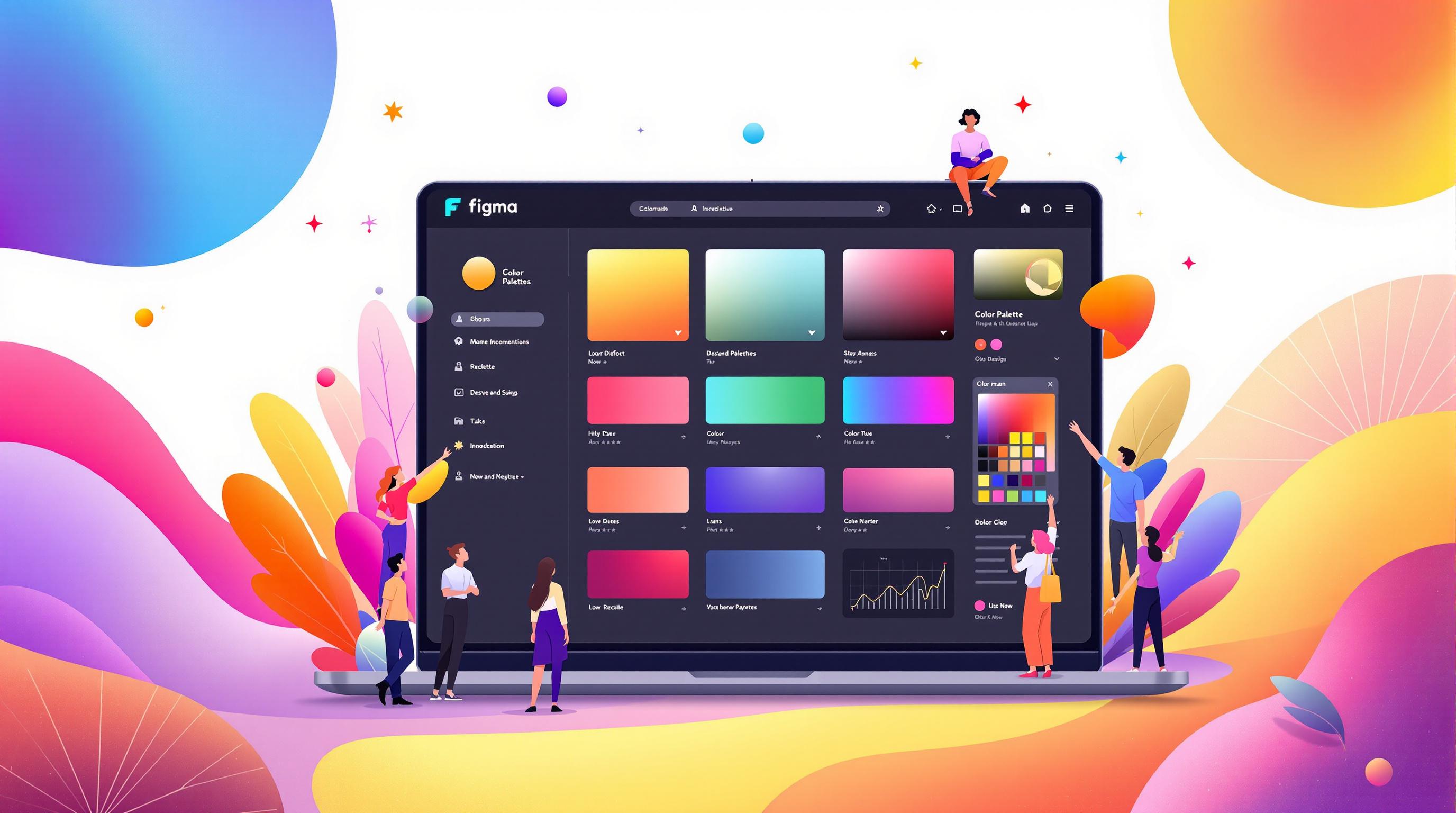
Setting Up Color Palettes in Figma

Creating Color Styles
In Figma, you can save time and ensure consistency by creating reusable color styles. Start by selecting an element, open the color picker, and save the chosen color as a style using the 'Create Style' option. Group these styles into categories to keep your design system organized and cohesive.
Color Categories
Categorizing your color styles by their function helps establish a clear hierarchy and makes them easier to use. Here's a simple structure for organizing your colors:
Each category should include variations that complement each other while maintaining enough contrast to meet accessibility standards. Figma's color style feature ensures these are applied consistently across your designs.
Color Naming System
A clear naming system makes it easier to find and apply colors. Combine the category, color, and intensity into a single name:
This approach keeps things simple and reduces mistakes. If you're collaborating with a team, document your naming conventions clearly so everyone stays on the same page.
Once your palette is organized, the next step is to document these colors properly for team-wide use.
Building Color Documentation
Setting Up a Color Guide Page
Start by creating a dedicated color guide page in Figma to serve as your team's go-to reference for colors. Organize colors into categories and present them in various contexts:
Large swatches (at least 100x100px) to showcase the color itself.
Text examples in different sizes to demonstrate readability.
UI components like buttons and cards to show practical applications.
Adding Color Values and Rules
Clearly document all key color details in an organized format. Here's an example of how to lay it out:
Use gradients to illustrate the relationship between different shades. Include practical rules like: "Avoid using this blue for text smaller than 16px" or "Ensure at least a 4.5:1 contrast ratio with background colors" to maintain accessibility and clarity.
If you want to take your documentation up a notch, consider using pre-built resources such as uncoverLAB's templates.
Using uncoverLAB Color Resources

For teams aiming to streamline the process, uncoverLAB provides ready-made templates designed to simplify color documentation. These templates can be customized to fit your specific needs and include:
Pre-configured color styles with logical, semantic names.
Accessibility-verified combinations for inclusivity.
Professional documentation layouts that are easy to use.
You can import uncoverLAB's palettes, modify them for your project, and add them to your team libraries to ensure consistency across designs.
Team Color Management
Centralizing Your Team's Color Palette
Once your color documentation is ready, it's time to make it accessible for everyone on your team. Use a dedicated Figma file as the go-to source for your team's color palette. This file should house all approved colors as Color Styles, ensuring they’re easy to use across all projects.
Here’s how to set up your color library:
Create a "Color System" file: Use Figma to establish a central file for your team's colors.
Define Color Styles: Follow the naming conventions outlined in your "Color Naming System" to keep everything organized.
Organize by Categories: Group colors into categories like Brand, UI, and Semantic Colors for quick reference.
Enable Team Access: Open the Assets panel, click the library icon, and adjust sharing settings to make the library accessible to your team.
Handling Color Updates Without Disruption
Updating colors can be tricky - changes need to be consistent and not interfere with ongoing projects. Figma’s Color Styles allow for global updates, but a structured process is key to avoiding unnecessary confusion.
Here’s a simple approach to manage updates:
Test Before Rolling Out: Use Figma’s branching feature to test updates in a staging file. This ensures changes don’t disrupt active work.
Keep the Team in the Loop: Inform team members about:
Which colors are changing
Why the updates are happening
When the changes will be implemented
How ongoing projects might be affected
Implement Gradually: Apply updates in smaller batches. Review how each change impacts existing designs and adjust based on feedback. Always test updates in branches before merging them into the main file.
Creating a Color System in Figma: 3 Easy Methods
Color Documentation Standards
Once you've organized your team's color palette, it's important to set clear standards to ensure it remains useful and accessible over time.
Color Accessibility Notes
For each key color combination in your interface, make sure to:
Record contrast ratios between text and background colors.
Identify compliance levels, noting whether pairs meet WCAG AA or AAA standards.
Specify use cases and any restrictions for each combination.
Here’s an example of how you can document accessibility information:
Light and Dark Mode Colors
To keep your brand identity consistent across light and dark display modes, map out corresponding color variants for each mode. Document these transitions clearly to avoid confusion.
When documenting, include:
Color temperature adjustments to maintain balance across modes.
Opacity and shadow guidelines for overlays to ensure consistency.
This approach helps streamline design workflows while maintaining usability across different environments.
Sharing Color Guidelines
Make your color documentation easily accessible to your team and stakeholders by sharing it through multiple formats. Options include team libraries, downloadable PDFs, or Figma Community files.
Additionally, provide clear instructions for integrating colors into new projects:
Steps for accessing and using the team library.
Directions on applying predefined color styles.
Guidelines for requesting new colors or updates.
If your team uses uncoverLAB's resources, be sure to outline how to incorporate their color palette templates into your documentation system. This ensures everyone stays aligned and can work efficiently.
Conclusion
Once your color palette is organized and documented, the next step is keeping it functional and accessible over time. Figma's tools make it easier to ensure consistent design while adhering to accessibility guidelines. By using standard practices, teams can maintain a cohesive and user-friendly design system.
Key Takeaways
Creating and managing a reliable color system involves focusing on the following areas:
Building a Solid Foundation
Set up structured color styles with clear, logical names.
Group colors into well-defined categories for easy navigation.
Keep all documentation centralized within Figma for seamless access.
Effective Team Collaboration
Leverage Figma team libraries for centralized color management.
Use plugins to validate accessibility, such as contrast checkers.
Define clear protocols for updating and maintaining your color system.
Comprehensive Documentation
Include details for light and dark mode variations, accessibility standards, and usage instructions.
Develop thorough style guides to support your team.
Ensure documentation is easily accessible to everyone involved.
Streamlining with Resources
For teams looking to save time, uncoverLAB offers pre-made templates and color palette libraries that can simplify your documentation process.
FAQs
How to add document colors in Figma?
Adding document colors in Figma is straightforward and helps maintain consistency:
Select the element with the color you want to save.
Click the "Style" icon in the right-hand sidebar.
From the dropdown, choose "Create Style".
Give your color style a name based on your team's naming convention (refer to the 'Color Naming System' section for guidance).
Click "Create Style" to save it.
Once you've set up your document colors, you can start organizing them into a structured color system for your designs.
How do you create a color system in Figma?
After defining your document colors, the next step is to create a structured color system that aligns with your design needs.
Start with Primary Colors
Use your brand's primary color as the foundation for the system.
Create Color Variations
Adjust the lightness and saturation to generate different shades (e.g., light 25-200, medium 300-600, dark 700-950).
Add Supporting Colors
Include:
Neutral colors for text and backgrounds
Accent colors for highlighting specific UI elements
Semantic colors for status indicators (e.g., success, error)
Leverage Figma's color library feature to share these colors across team projects, ensuring consistent usage.