Oct 2, 2024
Transform Your Site with Trendy Website Design Ideas
Looking to enhance your website's appeal? Discover trendy design styles like the bento box, offering structured layouts that boost engagement and improve user experience.

Fresh Website Design Ideas
Discover website design ideas that transform online interactions. Explore trends in organized layouts and eye-catching visuals. These ideas enhance site engagement and functionality.
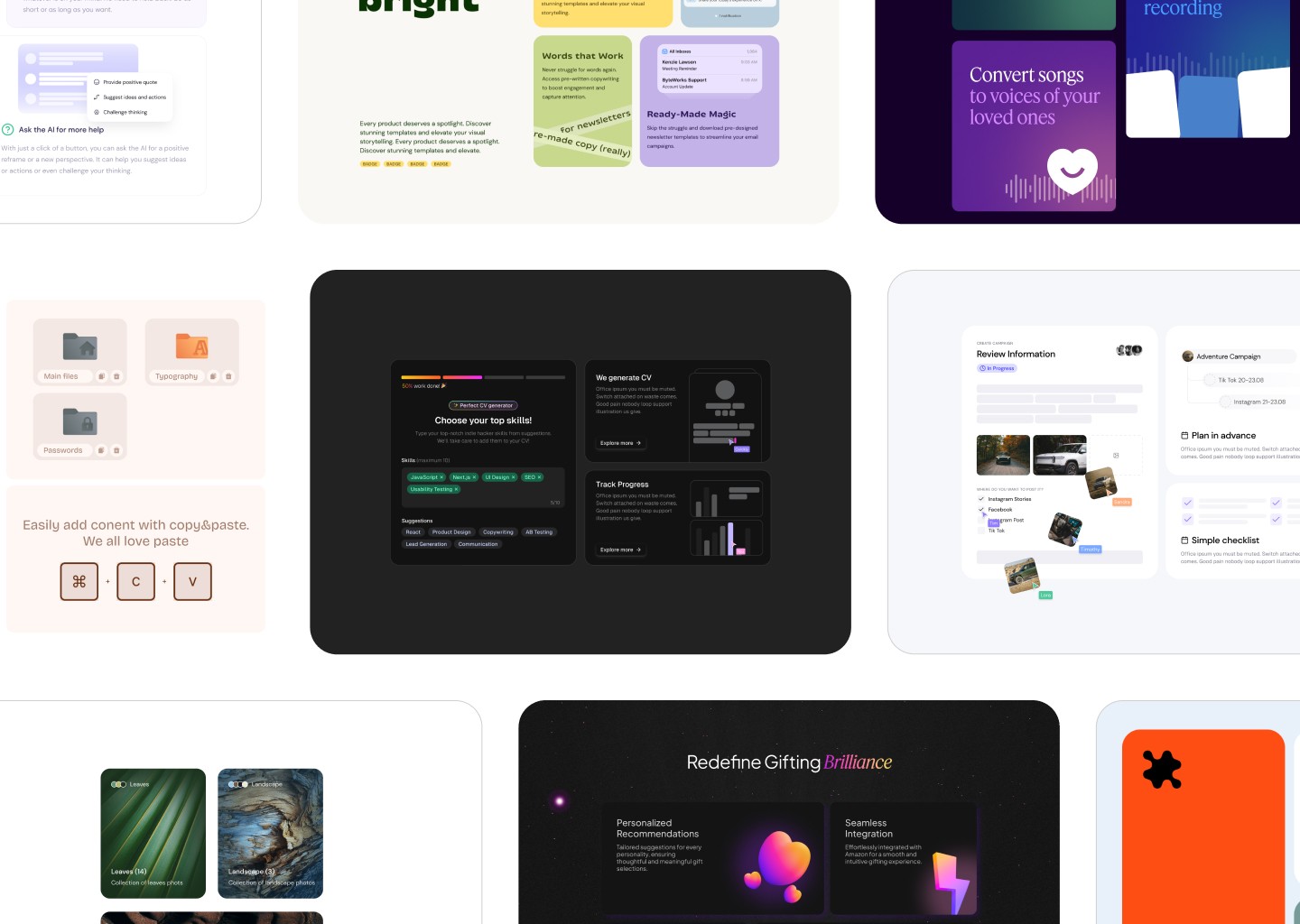
Have you seen the bento box style? This grid-based layout, inspired by Japanese design, organizes content effectively. It creates structured, attractive, and easy-to-navigate designs.
Key features include:
Compartmentalization: Divide content into clear sections for better understanding.
Visual Hierarchy: Guide users through your site with thoughtful design.
Aesthetic Presentation: Create layouts that capture and hold user attention.
These elements boost usability and make your website memorable, leading to improved user experiences.
Bento Box Design Explained
The bento box design trend is shaking up the way we think about website layouts. Inspired by the traditional bento box, this style organizes content into neat, compartmentalized sections. It uses grids to create an intuitive and visually appealing structure.
This design method enhances user experience by making navigation straightforward. Users can easily find what they need without feeling overwhelmed by cluttered content.
Origins of this trend can be traced back to Apple's grid-style promotional videos and Microsoft's Metro design language. Both have played a role in shaping how designers approach layout and content organization today.
Key aspects of the bento box design include:
Grid Layouts: Use structured grids to compartmentalize content.
Visual Clarity: Ensure each section is clear and distinct.
Ease of Navigation: Make it simple for users to move through the site.
This approach is gaining popularity because it combines functionality with aesthetics. It allows designers to present information in a way that’s both engaging and efficient. The bento box style is becoming a go-to choice for those looking to enhance user interaction and site usability.

Impact of Trendy Design Styles
Trendy design styles like the bento box are reshaping web design. These styles encourage creativity and adaptation, helping designers craft visually appealing sites.
Creative Experimentation: Designers are exploring new ways to present information. The bento box style, for example, organizes content into clean, easy-to-navigate sections. This approach enhances user experience by making sites intuitive and aesthetically pleasing. For more on how these modular elements can improve navigation and engagement, explore our insights on using Bento Boxes in web layout.
Practical Application: Real-world examples show the power of these trends. The Apple iPhone 14 Pro landing page is a standout, offering a sleek and engaging user journey. Other notable sites like Bolt and Linear also demonstrate how structured layouts can improve functionality and design.
Influential Designers: Contributors like Lokesh Ravichandru and Junhan Sim have played key roles in popularizing these styles. Their insights and resources guide designers in implementing these trends effectively, making information accessible and engaging.
By embracing these design styles, websites can deliver content in a way that captivates users. The combination of visual appeal and user-friendly navigation makes these trends a valuable asset in modern web design.
Key Takeaways on Design Ideas
Exploring new design trends can transform your website. The bento box style is a great example of how organized layouts and eye-catching visuals enhance user engagement. By experimenting with grid layouts and compartmentalization, you can create unique and efficient designs that stand out.
Here’s what to keep in mind:
Embrace New Trends: Adopting styles like the bento box can improve site aesthetics and functionality.
Experiment with Layouts: Use grid structures to organize content and make navigation intuitive.
Focus on Aesthetics: Ensure your designs are visually appealing to capture and retain user attention.
For inspiration, check out resources like Bento Grids and One Page Love. These platforms offer galleries of bento box UI designs that can spark ideas for your projects.
By incorporating these design principles, you'll be equipped to craft engaging and memorable websites. The right approach can lead to improved user experiences and a more visually appealing online presence.