Sep 23, 2024
Our Favourite Features and Benefits of Figma UI3
Explore how Figma UI3 simplifies design with enhanced features and control. Elevate your workflow with uncoverLAB's Figma resources.
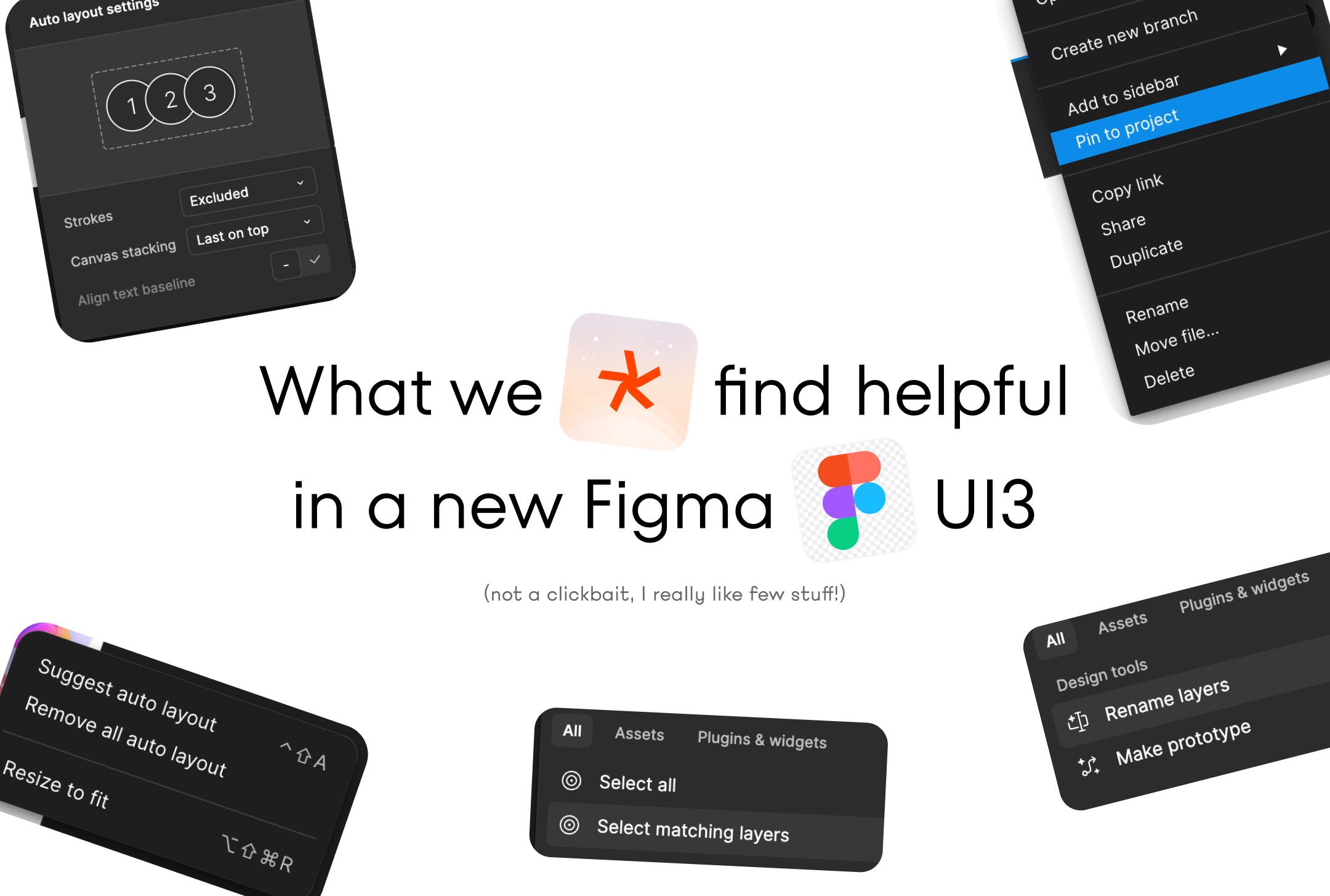
Why Figma decided to redesign their UI
Figma's UI3 redesign is all about simplifying your design experience. As Figma has evolved, so has the complexity, which is why this update focuses on making things more intuitive and approachable for everyone. This redesign ensures that your work remains the star of the show, drawing more emphasis to your canvas.
Here's what the new design brings:
Control: Resizable and collapsible panels give you more control over the interface. A lot of people are hate it, due to unnecessary edges margin, but you can use to it after few weeks of using.
Focus: Your work on the canvas stands out, making it easier to concentrate on what matters. I used to love to work after clicking "cmd+.", but also checking frame, in frame in frame in frame was such a pain.
Overall it's nice improvement.
Intuitive Features: Improved placement and grouping of features make them easier to use and adapt to different contexts.
Consistency: Switching between their different products: Figma Design, FigJam, Dev Mode, and Figma Slides is now possible.
It's solid foundation not only bring the fresh air into your current projects and workflow but also sets the stage for future innovations.
Our Top Features of Figma UI3
Figma UI3 brings some standout features that make designing smoother. The redesigned interface, with resizable and collapsible panels, offers more control over your workspace. While there's been some grumbling about it, after a month, it feels more intuitive and less cluttered.
Key Features:
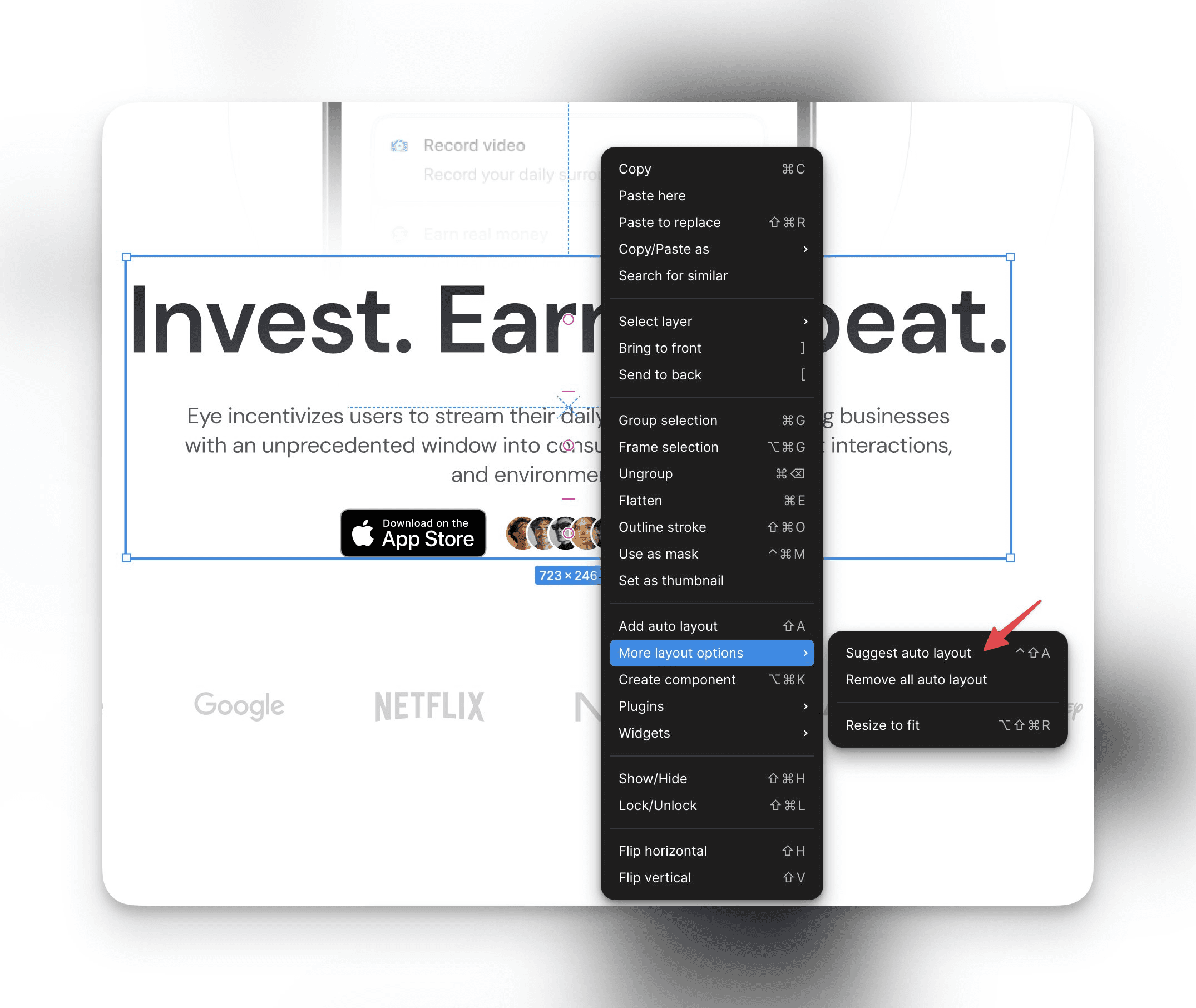
Suggest Auto-Layout: Simplifies arranging elements.
👉 Select your items,
👉 right-click,
👉 choose "Suggest auto-layout"
This feature speeds up the design process!
Rename Layers: Need to rename multiple layers? (My biggest pain)
👉 Select the frame, hit the "✨" in the toolbar
👉 choose "Rename layers"
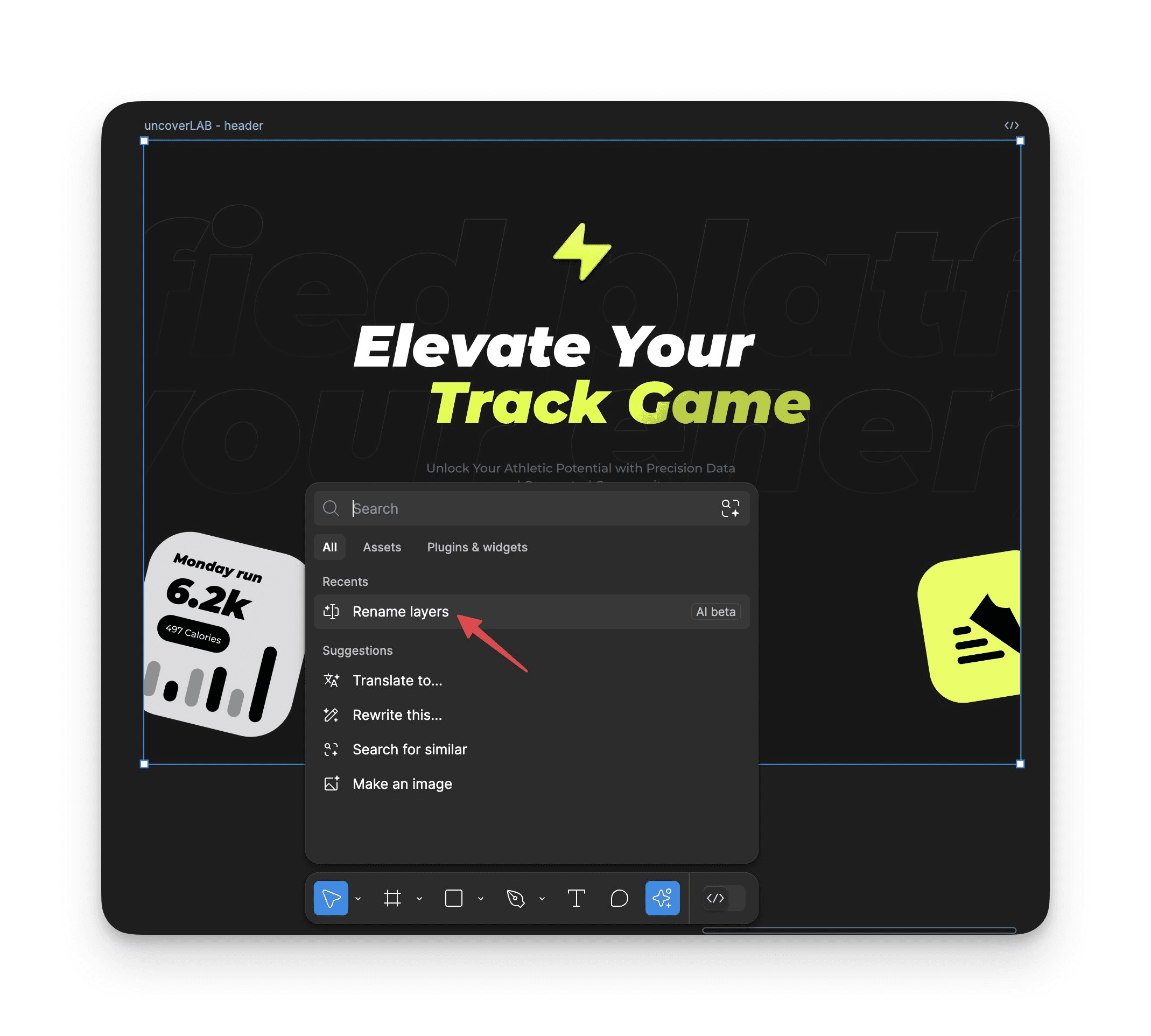
You can rename up to 50 layers at once, improving workflow efficiency.
Select Matching Layers:
👉 Select layers,
👉 choose the ✨ menu,
👉 pick "Select matching layers".
Update these layers simultaneously, like changing colors, to streamline tasks! Love it!❤️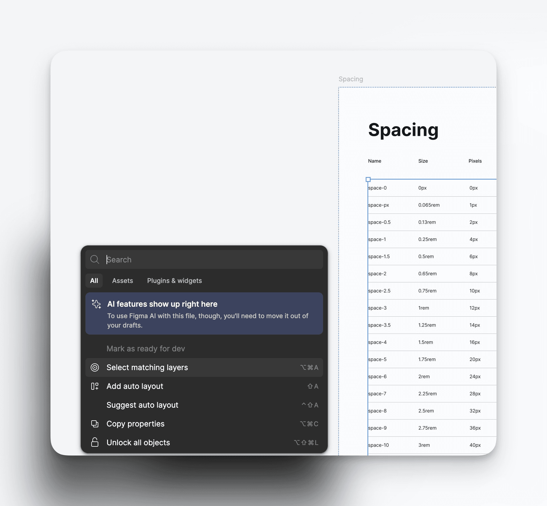
Pin to Project: Keep your workspace organized by pinning essential files.
👉 Right-click on a file and select "Pin to project".
This helps in maintaining a tidy project view.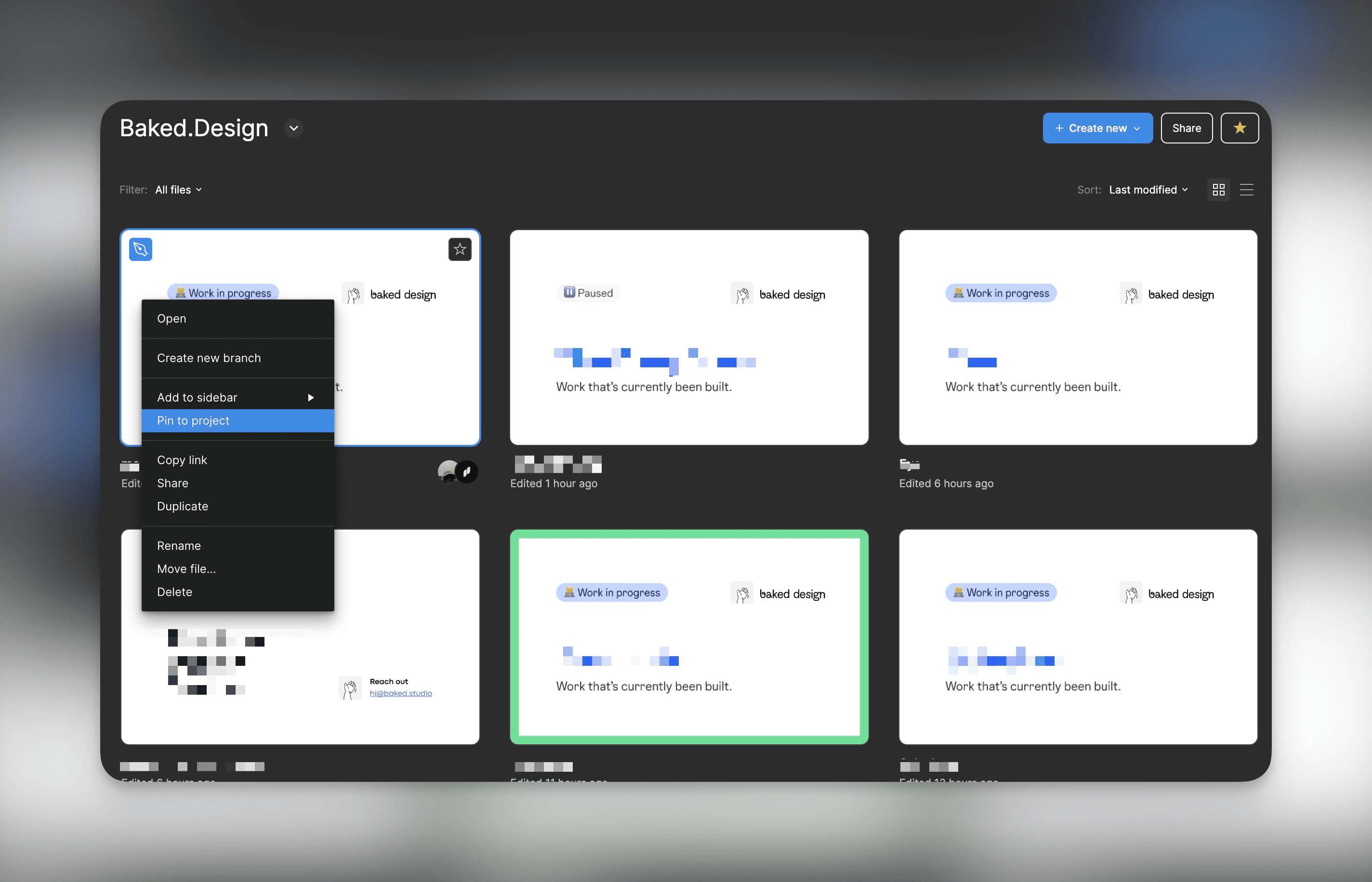
Auto layout settings
→ Select the frame of the component
→ Select "Auto-layout settings" in the right panel
→ Select "First on top", "Last on top"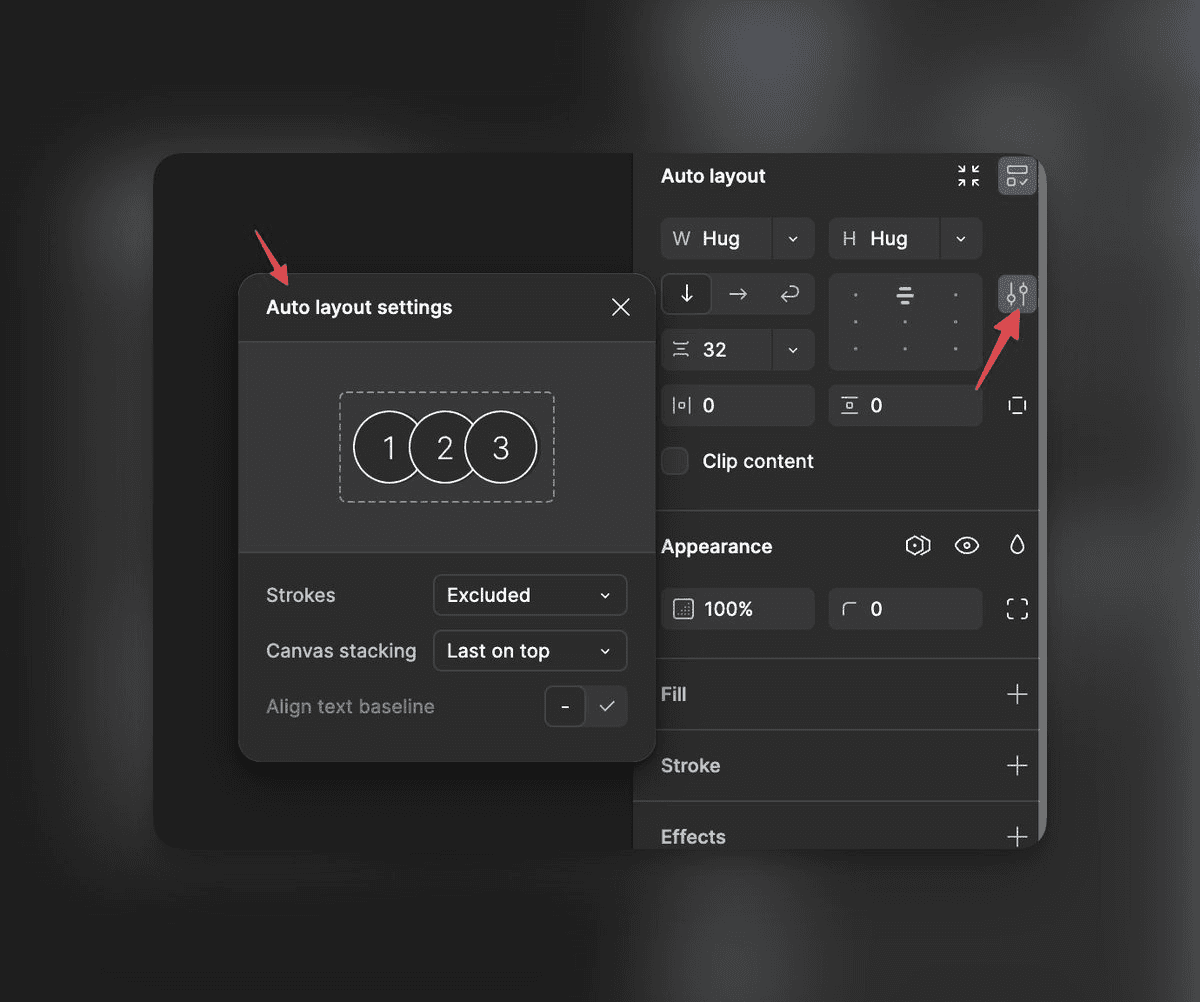
These features enhance usability and make design tasks more efficient. Figma UI3 is all about making life easier for designers, allowing more focus on creativity and less on tedious tasks.
Adapting to Figma UI3
involves understanding how changes affect mental models and cognitive load. Users might initially find the increased clicks and new padding around panels challenging. This is where cognitive biases like the familiarity principle and anchoring bias come into play.
We naturally gravitate towards familiar interfaces. The shift in UI3 requires adaptation, which can feel uncomfortable at first. Over time, as you get used to the new layout, the design experience becomes more efficient and intuitive.
Here's a breakdown of what to expect:
Increased Clicks: You might notice more clicks are needed at first. This is due to the new arrangement of features.
Panel Padding: Additional padding around panels might seem odd, but it helps in creating a cleaner workspace.
Cognitive Load: Adjusting to these changes might initially feel overwhelming. It's important to take time to explore and familiarize yourself with the new setup.
Over time, these changes lead to a smoother and more efficient workflow. As you become comfortable with the updates, your design process will benefit from the enhancements Figma UI3 offers.
Figma UI3 Takeaways
Figma UI3 boosts design efficiency and delivers real benefits. Here are the key features:
Better Control: Resize and collapse panels for a more flexible workspace.
Smoother Workflow: Auto-Layout suggestions and layer renaming speed up your work.
Unified Experience: Consistent design across Figma products makes multitasking easier.
Learning Curve: You might need time to adjust to new click patterns and panel spacing.
For designers looking to enhance their projects, uncoverLAB provides a valuable resource with a library of Figma website templates and app user journeys, streamlining the design process.
Figma UI3 takes some getting used to, but it expands your design toolkit. These updates sharpen your creative process and make you more efficient.
Adding Figma UI3 to your workflow helps you grow as a designer.
uncoverLAB help you to not start from scratch
uncoverLAB helps improve your design workflow. We offer a library of Figma website templates, app user journeys, wireframes, and trendy color palettes. You can easily copy and paste our resources directly into your projects.
Explore and implement user journeys from popular apps to create efficient, user-centric designs. Our components, available in both light and dark modes, ensure your designs are always on-point.
We update our library weekly, equipping you with the latest design elements. This keeps you in sync with current design trends. Our resources help you save time on repetitive tasks and streamline your process.
We've teamed up with experienced designers from top companies like Meta and Netflix to craft these elements. You get top-tier expertise without long contracts or complex onboarding. Our flexible options adapt to your changing needs.
uncoverLAB is more than templates - it's a tool that enhances creativity, productivity, and growth. We streamline your design process, allowing you to focus on creating engaging, intuitive user experiences.