Sep 11, 2024
Figma website section designs
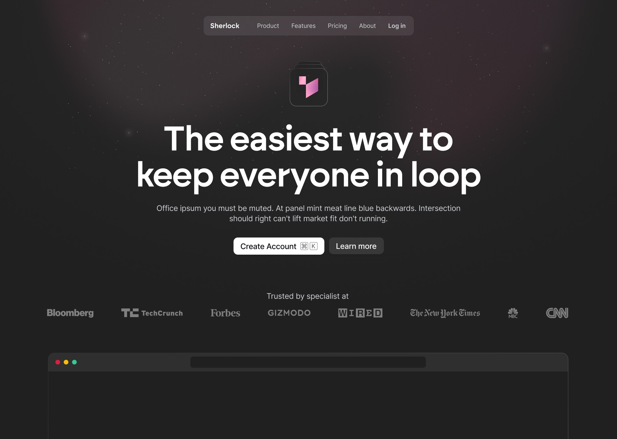
Streamline your web design process with Figma website section designs. Enhance productivity and create responsive, professional-grade layouts.

Understanding Figma Website Section Designs
Ever feel bogged down by the endless design process? Figma's website section designs can simplify things for you. Our platform offers developer and designer modes, making it a breeze to switch and collaborate.
With Figma, you get:
Real-Time Collaboration: Work with your team seamlessly, no more back-and-forth emails.
Responsive Design: Toggle between different preview sizes to ensure your designs look great on any device.
Prototyping Tools: Create interactive and engaging designs that help you present to clients and gather feedback effortlessly.
These features mean you spend less time on the basics and more time being creative. Figma’s intuitive interface and auto-layout features ensure your designs are both beautiful and functional. Whether you’re working on a new web app or redesigning an existing site, Figma’s tools help you create a seamless user experience.
Designers can stay ahead of the curve with Figma’s ability to handle grids, layouts, and reusable components. This means more consistency in your designs and less time tweaking minor details.
In short, Figma website section designs help you streamline your workflow, making web design faster and more efficient.
Creating HTML From Figma Designs
Switching a design from Figma to HTML can seem daunting, but it’s a streamlined process with the right tools. Let’s break it down.
First, switch to Developer Mode in Figma. This mode helps export the design elements you need. You'll see the CSS code for each element, making the conversion process easier.
Next, use third-party plugins. Plugins like Visual Copilot from Builder.io are lifesavers. They can export sections of your mockup into HTML/CSS or even frameworks like React. Here’s how:
Install Visual Copilot: Add the plugin to your Figma workspace.
Select the Section: Choose the part of your design you want to export.
Export to Code: Use the plugin to generate the code in your desired format (HTML, CSS, React).
After exporting, adjust for responsiveness. Figma lets you preview designs in different sizes, so ensure your code matches these responsive layouts. This step is crucial to maintain the design's integrity across devices.
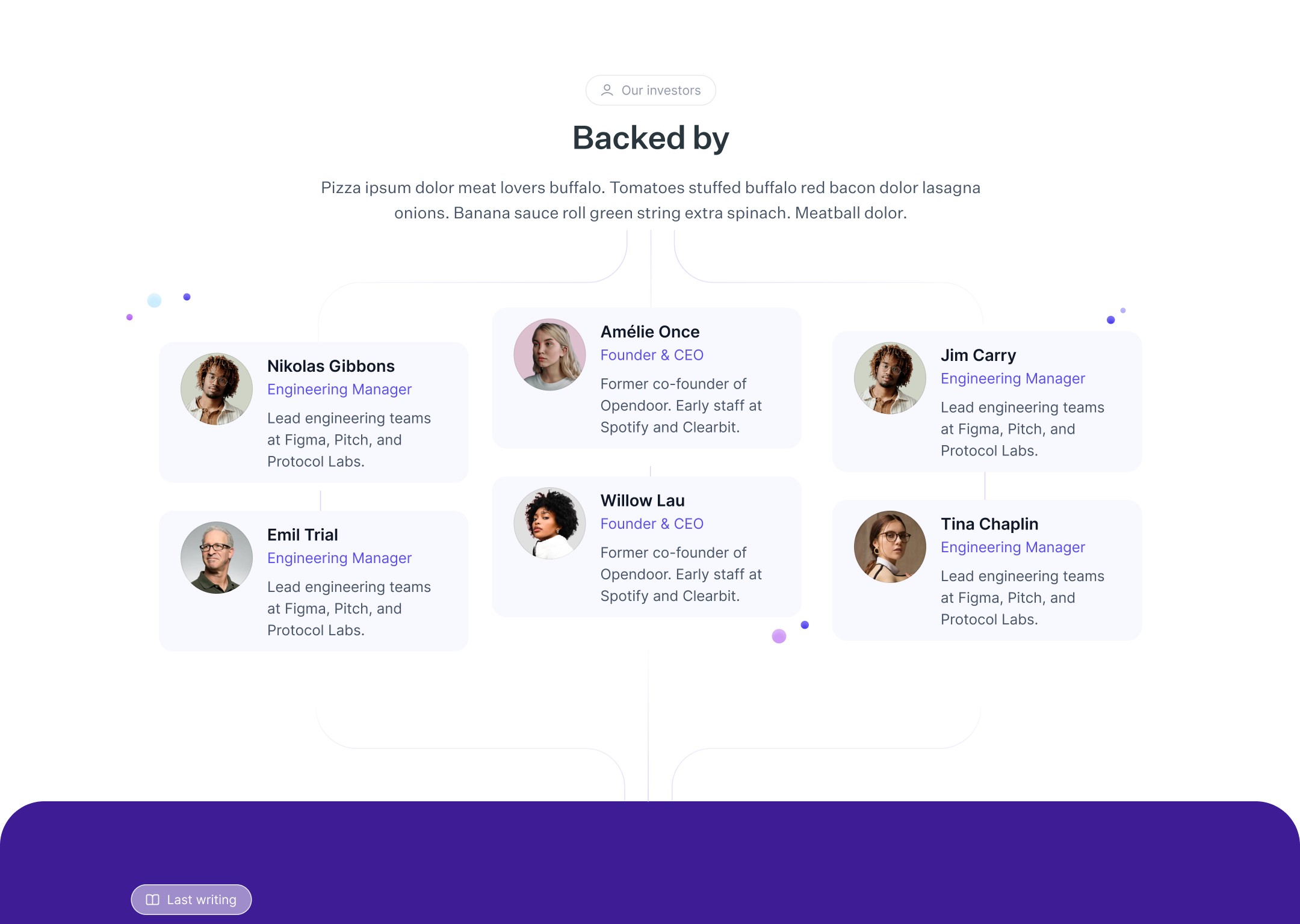
To streamline your workflow even further, consider exploring essential website sections that contribute to effective digital presence. This resource delves into key components like headers, footers, and call-to-action buttons, emphasizing the importance of UX and interaction design.
Reuse components. Export larger pages in sections to build a library of reusable components. This approach makes your code more modular and easier to maintain.
Using these steps, you can efficiently turn your Figma designs into functional HTML code. It saves time and ensures your designs look consistent across all platforms.
Best Practices for Responsive Figma Designs
Ensuring your Figma designs are responsive across devices is crucial. Here are some best practices to help you nail it.
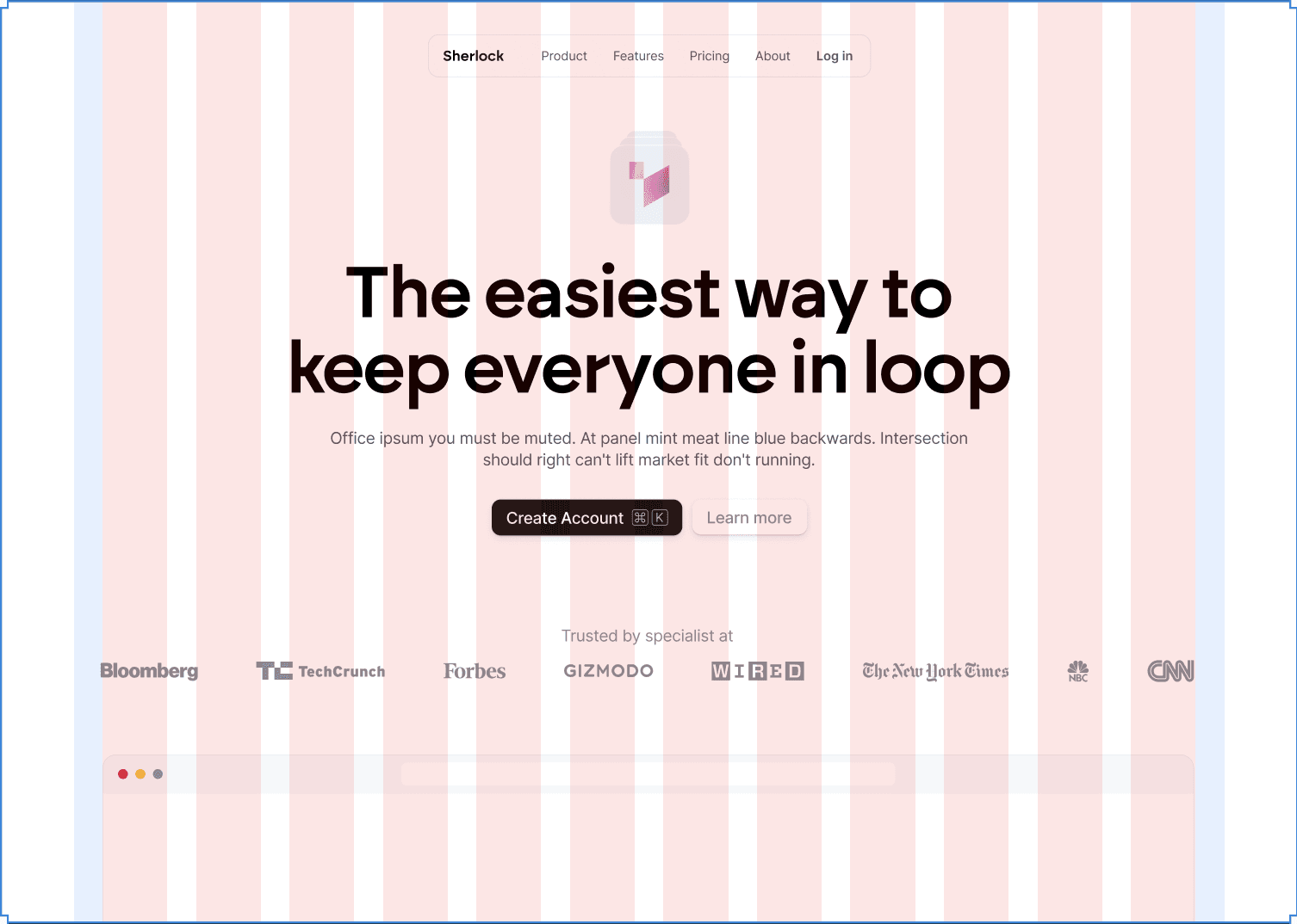
Set up grids and layouts for different screen sizes. Use a consistent grid system:

12 columns: For desktops.
8 columns: For tablets.
4 columns: For mobile.
This helps maintain a structured and balanced design.
Utilize Figma’s auto-layout features. These features allow components to adapt automatically to different screen sizes. Nest auto-layouts to manage more complex designs and ensure everything scales beautifully.
Create prototypes to simulate user interactions at various breakpoints. This helps you see how your design functions on different devices and adjust accordingly.
Figma’s built-in responsive design settings are a lifesaver. Toggle between different preview sizes to see how your design looks on various screens. This helps you identify and fix any issues before moving forward.
Make use of reusable components. Set up libraries to standardize elements across projects. This ensures design consistency and saves time when working on multiple projects.

Use row grids for vertical spacing. This maintains visual hierarchy and readability, making your design look clean and professional.
By following these steps, you can create responsive designs that look great on any device.
Key Takeaways From Figma Website Section Designs
Figma website section designs significantly improve web design workflows. Here's why:
Work Smarter, Not Harder: Figma offers real-time collaboration, responsive design previews, and prototyping tools. You'll spend less time struggling with tools and more time creating.
Easy HTML Conversion: Moving from Figma to HTML is straightforward with Developer Mode and plugins like Visual Copilot. Exporting and tweaking design elements for responsiveness ensures your design looks great on all devices.
Responsive Design Best Practices: Setting up grids and layouts for different screen sizes, using auto-layout features, and creating prototypes help maintain design integrity. Your designs will look good on everything from smartphones to desktop monitors.
Figma's user-friendly interface and auto-layout features make creating beautiful and functional designs simpler. By following these practices, you'll create polished designs more efficiently.